Creating a Pricing Table with Twitter Bootstrap 3 list group component
Objective
Pricing Tables are one of the essential components of any website selling products or service. Though Twitter Boortstrap 3 (like it's previous versions) does not have a Pricing Table component out of the box, it has list group component. The purpose of this component is to render complex and customized content. Leveraging that feature we will create a simple pricing table in this tutorial and along with an explanation of what CSS rules are used to make a list group and how to customize it.
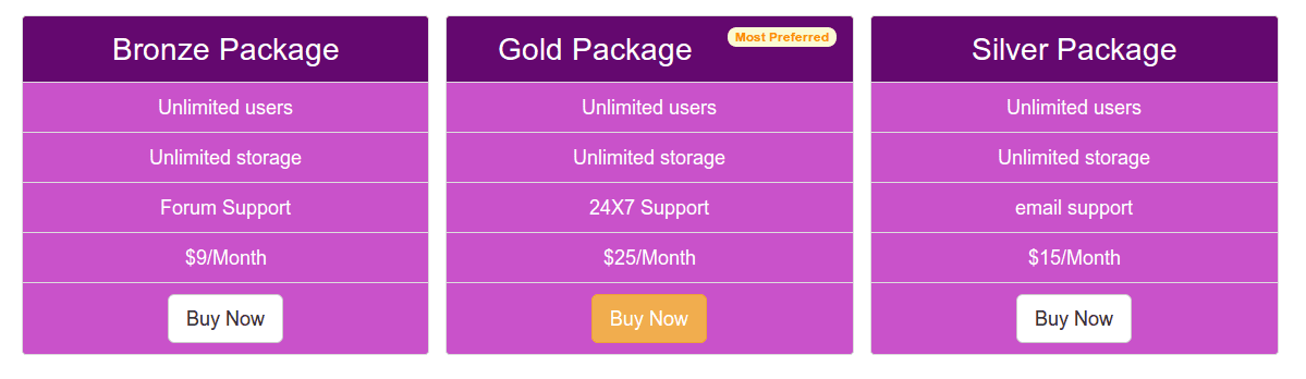
How a typical looks like
You may view a live demo of the pictorial above here. And following is the code used for example.
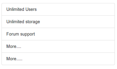
<div class="container">
<div class="row">
  <ul class="list-group col-lg-4">
  <li class="list-group-item">Unlimited Users</li>
  <li class="list-group-item">Unlimited storage</li>
  <li class="list-group-item">Forum support</li>
  <li class="list-group-item">More....</li>
  <li class="list-group-item">More.....</li>
</ul>
</div>
</div>
list-group and list-group-item
list-group class has following CSS rules
.list-group {
  padding-left: 0;
  margin-bottom: 20px;
}

.list-group-item {
  position: relative;
  display: block;
  padding: 10px 15px;
  margin-bottom: -1px;
  background-color: #ffffff;
  border: 1px solid #dddddd;
}

.list-group-item:first-child {
  border-top-right-radius: 4px;
  border-top-left-radius: 4px;
}

.list-group-item:last-child {
  margin-bottom: 0;
  border-bottom-right-radius: 4px;
  border-bottom-left-radius: 4px;
}
badges
You may use badges component to embrace the list-group. The following code shows how to do that.
<div class="container">
<div class="row">
  <ul class="list-group col-lg-4">
  <li class="list-group-item"><span class="badge">Very important</span>Unlimited Users</li>
  <li class="list-group-item">Unlimited storage</li>
  <li class="list-group-item">Forum support</li>
  <li class="list-group-item">More....</li>
  <li class="list-group-item">More.....</li>
</ul>
</div>
</div>
You may view live demo here. The CSS code used to place badges within list-goup is shown below.
.list-group-item > .badge {
  float: right;
}

.list-group-item > .badge + .badge {
  margin-right: 5px;
}
Note that because of float:right, it is pushed to right-hand side of the actual content within a list group item.
Linked items
<div class="container">
<div class="row">
  <div class="list-group col-lg-4">
  <a href="#" class="list-group-item active">
    The pricing list
  </a>
  <a href="#" class="list-group-item">Unlimited users</a>
  <a href="#" class="list-group-item">Unlimited storage</a>
  <a href="#" class="list-group-item">email support</a>
  <a href="#" class="list-group-item">More...</a>
</div>
</div>
</div>
You may view live demo here. The CSS code used to place linked items within list group is shown below.
a.list-group-item {
  color: #555555;
}

a.list-group-item .list-group-item-heading {
  color: #333333;
}

a.list-group-item:hover,
a.list-group-item:focus {
  text-decoration: none;
  background-color: #f5f5f5;
}

a.list-group-item.active,
a.list-group-item.active:hover,
a.list-group-item.active:focus {
  z-index: 2;
  color: #ffffff;
  background-color: #428bca;
  border-color: #428bca;
}

a.list-group-item.active .list-group-item-heading,
a.list-group-item.active:hover .list-group-item-heading,
a.list-group-item.active:focus .list-group-item-heading {
  color: inherit;
}

a.list-group-item.active .list-group-item-text,
a.list-group-item.active:hover .list-group-item-text,
a.list-group-item.active:focus .list-group-item-text {
  color: #e1edf7;
}
Custom content
This example shows list group with custom content. HTML and CSS code present in Bootstrap's css is shown below.
<div class="container">
<div class="row">
  <div class="list-group col-lg-4">
  <a href="#" class="list-group-item active">
    <h4 class="list-group-item-heading">List group item heading</h4>
    <p class="list-group-item-text">...</p>
  </a>
</div>
</div>
</div>
CSS code:
.list-group-item-heading {
  margin-top: 0;
  margin-bottom: 5px;
}

.list-group-item-text {
  margin-bottom: 0;
  line-height: 1.3;
}
Pricing Table
Now, we will take the basic structure of list group component and convert it to a simple but attractive Pricing Table.
Following is the code containing basic HTML code we have used to create the Pricing Table. Note that we have added buttons within the last list items. For the left and right most columns, we have used Bootstrap's default button. For the center column, we have added the button with a different class(warning) so that it looks different from others. Further, we have also added a badge in the first list item of the center column.
<!DOCTYPE html>
<html>
  <head>
    <title>Bootstrap 101 Template</title>
    <meta name="viewport" content="width=device-width, initial-scale=1.0 ">
    <!-- Bootstrap -->
    <link href="dist/css/bootstrap.min.css" rel="stylesheet" media="screen"><!-- HTML5 Shim and Respond.js IE8 support of HTML5 elements and media queries -->
    <!-- WARNING: Respond.js doesn't work if you view the page via file:// -->
    <!--[if lt IE 9]>
      <script src="https://oss.maxcdn.com/libs/html5shiv/3.7.0/html5shiv.js"></script>
      <script src="https://oss.maxcdn.com/libs/respond.js/1.3.0/respond.min.js"></script>
    <![endif]-->
  </head>
  <body>
  <div class="container">
  <div class="row">
  <ul class="list-group col-lg-4">
  <li class="list-group-item">Bronze Package</li>
  <li class="list-group-item">Unlimited users</li>
  <li class="list-group-item">Unlimited storage</li>
  <li class="list-group-item">Forum Support</li>
  <li class="list-group-item">$9/Month</li>
  <li class="list-group-item"><a href="#"><button class="btn btn-lg btn-default">Buy Now</button></a></li>
</ul>
<!--second-->
<ul class="list-group col-lg-4">
  <li class="list-group-item">Gold Package<span class="badge">Most Preferred</span></li>
  <li class="list-group-item">Unlimited users</li>
  <li class="list-group-item">Unlimited storage</li>
  <li class="list-group-item">24X7 Support</li>
  <li class="list-group-item">$25/Month</li>
  <li class="list-group-item"><a href="#"><button class="btn btn-warning btn-lg">Buy Now</button></a></li>
</ul>
<!--third-->
<ul class="list-group col-lg-4">
  <li class="list-group-item">Silver Package</li>
  <li class="list-group-item">Unlimited users</li>
  <li class="list-group-item">Unlimited storage</li>
  <li class="list-group-item">email support</li>
  <li class="list-group-item">$15/Month</li>
  <li class="list-group-item"><a href="#"><button class="btn btn-lg btn-default">Buy Now</button></a></li>
</ul>
</div>
</div>
    <!-- jQuery (necessary for Bootstrap's JavaScript plugins) -->
    <script src="https://code.jquery.com/jquery.js"></script>
    <!-- Include all compiled plugins (below), or include individual files as needed -->
    <script src="dist/js/bootstrap.min.js"></script>
  </body>
</html>
Now we will customize the out of the box look and feel adding CSS classes. The first snippet of CSS code will add some top padding to the page.
body {
  padding-top: 70px
  }
And then, by adding the following CSS code we will customize background color, font color, text alignment and font size of the content within list items.
ul.list-group.col-lg-4 > li {
  background-color: #c952ca;
  color: white;
  text-align: center;
  font-size:125%;
  }
But we want to make the first list item of the center column look different. So, we add the following CSS code. We have used :first-child pseudo element for accessing the desired list item.
ul.list-group.col-lg-4 > li.list-group-item:first-child{
  background-color: #64086f;
  font-size: 200%;
  }
To make the badge look different, we then add the following CSS code.
.badge {
  background-color: #FAFAD2;
  color:#FF8C00;
  }
You can view the working example here. And may download the code from the link placed at the begining of the tutorial.
Questions? Suggestions? Join the discussion below. For the upcoming tutorials, please subscribe to our Feed.
Previous: Twitter Bootstrap Alerts and Errors tutorial
Next:
How to center a div using Twitter Bootstrap 3
- Weekly Trends and Language Statistics
- Weekly Trends and Language Statistics