Python Scikit-learn: Create a Principal component analysis of iris dataset
Python Machine learning Iris Visualization: Exercise-16 with Solution
From Wikipedia -
Principal component analysis (PCA) is a statistical procedure that uses an orthogonal transformation to convert a set of observations of possibly correlated variables (entities each of which takes on various numerical values) into a set of values of linearly uncorrelated variables called principal components. This transformation is defined in such a way that the first principal component has the largest possible variance (that is, accounts for as much of the variability in the data as possible), and each succeeding component in turn has the highest variance possible under the constraint that it is orthogonal to the preceding components. The resulting vectors (each being a linear combination of the variables and containing n observations) are an uncorrelated orthogonal basis set. PCA is sensitive to the relative scaling of the original variables.
Write a Python program to create a Principal component analysis (PCA) of iris dataset.
Sample Solution:
Python Code:
import pandas as pd
import numpy as np
import matplotlib.pyplot as plt
from mpl_toolkits.mplot3d import Axes3D
from sklearn import decomposition
from sklearn import preprocessing
# import iris.csv
iris = pd.read_csv("iris.csv")
# Converting string labels into numbers.
#creating labelEncoder
le = preprocessing.LabelEncoder()
# Converting string labels into numbers.
iris.Species = le.fit_transform(iris.Species)
#Drop id column
iris = iris.drop('Id',axis=1)
X = iris.iloc[:, :-1].values
y = iris.iloc[:, 4].values
fig = plt.figure(1, figsize=(7, 6))
plt.clf()
ax = plt.axes(projection='3d')
plt.cla()
pca = decomposition.PCA(n_components=3)
pca.fit(X)
X = pca.transform(X)
for name, label in [('Setosa', 0), ('Versicolour', 1), ('Virginica', 2)]:
    ax.text3D(X[y == label, 0].mean(),
              X[y == label, 1].mean() + 1.5,
              X[y == label, 2].mean(), name,
              horizontalalignment='center',
              bbox=dict(alpha=.5, edgecolor='w', facecolor='w'))
# Reorder the labels to have colors matching the cluster results
y = np.choose(y, [1, 2, 0])
ax.scatter(X[:, 0], X[:, 1], X[:, 2], c=y, cmap=plt.cm.nipy_spectral,
           edgecolor='k')
ax.w_xaxis.set_ticklabels([])
ax.w_yaxis.set_ticklabels([])
ax.w_zaxis.set_ticklabels([])
plt.show()
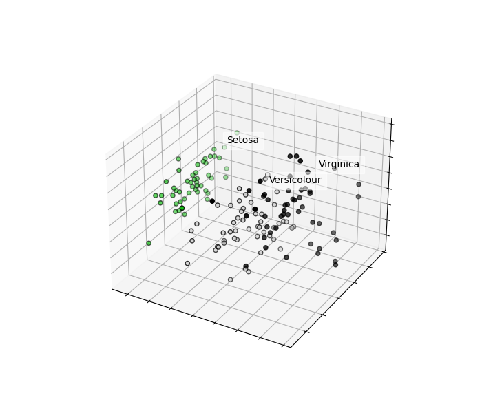
Sample Output:
Go to:
Python Code Editor:
Have another way to solve this solution? Contribute your code (and comments) through Disqus.
What is the difficulty level of this exercise?