A tutorial on Responsive and unresponsive Grids by Pure CSS
Objective
Grids have become ubiquitous when it comes to Web project layouts. Pure CSS is no exception. It has a module for both Responsive and an unresponsive Grid. In this, we will delve deep to understand the minutes of Grids offered by Pure CSS.
Fundamentals
As always, Pure Grids are made up of rows and columns. pure-g-r and pure-g are the CSS classes responsible for creating responsive and unresponsive rows here. Columns are created with a CSS class which looks like pure-u-x-x, where 'x' is a positive integer.
Now, suppose you want to create a two column grid and the left column takes two third and the right column takes one third of the viewport (i.e. available width), then CSS class pure-u-2-3 is to be applied on the left column and the right column has to adopt CSS class pure-1-3. Both of the columns must be a descendant of an element having either pure-g-r or pure-g depending upon whether you are creating a responsive layout or an unresponsive one.
Here is the code for the above (responsive)
<div class="pure-g-r">
<div class="pure-u-2-3">
<p>Lorem ipsum dolor sit amet, consectetuer adipiscing elit. Nam cursus. Morbi ut mi. Nullam enim leo, egestas id, condimentum at, laoreet mattis, massa.</p>
</div><div class="pure-u-1-3"><p>Lorem ipsum dolor sit amet, consectetuer adipiscing elit. Nam cursus. Morbi ut mi. Nullam enim leo, egestas id, condimentum at, laoreet mattis, massa.</p></div></div>
View a simple layout on this in a separate window.
Here is the code for the unresponsive
<div class="pure-g">
<div class="pure-u-2-3">
<p>Lorem ipsum dolor sit amet, consectetuer adipiscing elit. Nam cursus. Morbi ut mi. Nullam enim leo, egestas id, condimentum at, laoreet mattis, massa.</p>
</div><div class="pure-u-1-3">
<p>Lorem ipsum dolor sit amet, consectetuer adipiscing elit. Nam cursus. Morbi ut mi. Nullam enim leo, egestas id, condimentum at, laoreet mattis, massa.</p>
</div>
</div>
View a simple layout on this in a separate window.
General syntax:
So, the general syntax for creating Grids with Pure CSS is as follows
<div class="pure-g-r">
<div class="pure-u-x1-y">
....</div>
<div class="pure-u-x2-y">....</div></div>
Where, (i)x1,x2,....xn and y are positive integers, (ii)x1+x2+..._xn = y. You decide what shall be the value of x1,x2 etc depending upon the width of the column, i.e. how much portion of the total width(y) you wan to assign to a particular column.
Inclusion to an HTML file
<link rel="stylesheet" href="http://yui.yahooapis.com/pure/0.1.0/pure-min.css">
This is how you include all the pure css modules to an html file. If you want to include only the Grid module, you may replace thishttp://yui.yahooapis.com/pure/0.1.0/pure-min.css with http://yui.yahooapis.com/pure/0.1.0/grids-min.css for applying a responsive grid. For nonresponsive, include http://yui.yahooapis.com/pure/0.1.0/grids-nr-min.css instead of http://yui.yahooapis.com/pure/0.1.0/grids-min.css
Pure CSS is modular, so you may keep adding separate modules along with the grid module like -
<link rel="stylesheet" href="http://yui.yahooapis.com/combo?pure/0.1.0/base-min.css&pure/0.1.0/grids-min.css&pure/0.1.0/forms-min.css">
Creating padding around content
Looking to add some padding around your content residing within a Grid column? There are two ways. The following CSS and HTML code show the first one.
CSS Code:
.writeup, .ad {padding: 1em;}
HTML Code:
 <div class="pure-g-r">
 <div class="pure-u-2-3">
 <p class="writeup">Lorem ipsum dolor sit amet, consectetuer adipiscing elit. Nam cursus. Morbi ut mi. Nullam enim leo, egestas id, condimentum at, laoreet mattis, massa.</p>
 </div>
 <div class="pure-u-1-3">
 <p class="ad">Lorem ipsum dolor sit amet, consectetuer adipiscing elit. Nam cursus. Morbi ut mi. Nullam enim leo, egestas id, condimentum at, laoreet mattis, massa.</p>
 </div>
 </div>
So this way we create separate CSS classes to add padding and nest the content within an element containing that class.
There is the second method also. You may add padding directly to the grid. Let's see.
CSS Code:
.writeup, .ad {padding: 1em;}
HTML Code:
 <div class="pure-g-r">
 <div class="pure-u-2-3 writeup">
 <p>Lorem ipsum dolor sit amet, consectetuer adipiscing elit. Nam cursus. Morbi ut mi. Nullam enim leo, egestas id, condimentum at, laoreet mattis, massa.</p>
 </div>
 <div class="pure-u-1-3 ad">
 <p>Lorem ipsum dolor sit amet, consectetuer adipiscing elit. Nam cursus. Morbi ut mi. Nullam enim leo, egestas id, condimentum at, laoreet mattis, massa.</p>
 </div>
 </div>
You may view that the layout breaks.
To get rid of this problem, you may add box-sizing: border-box; to the Grid. This includes the padding and border, but not the margin, to the width. So, our CSS becomes (HTML code unaltered though)
.pure-g-r > div{box-sizing: border-box;}.writeup, .ad {padding: 1em;}
You may need to add vendor prefixes like -moz-box-sizing: border-box; /* Firefox 1, probably can drop this */ -webkit-box-sizing: border-box; to make sure that it works in all browsers. You may add prefixfree.min.js just below the stylesheets if you are not fond of adding vendor prefixes for CSS properties.
There are issues with using box-sizing: border-box; though. It is not supported by all of the browsers and setting this to all the grid units would make it difficult to change it later on.
Nesting
Pure Grid supports nesting of Grids. In the example below, we have created a simple two column layout and then the left grid is nesting another three column grid.
 <!doctype html>
 <html lang="en">
 <head>
 <meta charset="utf-8">
 <meta name="viewport" content="width=device-width, initial-scale=1.0 ">
 <title>Nesting of Grids example with Pure css</title>
 <link rel="stylesheet" href="http://yui.yahooapis.com/pure/0.1.0/pure-min.css">
 </head>
 <body>
 <div class="pure-g-r">
 <div class="pure-u-2-3">
 <div class="pure-g-r">
 <div class="pure-u-1-3">
 <p>Lorem ipsum dolor sit amet, consectetuer adipiscing elit. Nam cursus. Morbi ut mi. Nullam enim leo, egestas id, condimentum at, laoreet mattis, massa.</p>
 </div>
 <div class="pure-u-1-3">
 <p>Lorem ipsum dolor sit amet, consectetuer adipiscing elit. Nam cursus. Morbi ut mi. Nullam enim leo, egestas id, condimentum at, laoreet mattis, massa.</p>
 </div>
 <div class="pure-u-1-3">
 <p>Lorem ipsum dolor sit amet, consectetuer adipiscing elit. Nam cursus. Morbi ut mi. Nullam enim leo, egestas id, condimentum at, laoreet mattis, massa.</p>
 </div>
 </div>
 </div>
 <div class="pure-u-1-3 ad">
 <p>Lorem ipsum dolor sit amet, consectetuer adipiscing elit. Nam cursus. Morbi ut mi. Nullam enim leo, egestas id, condimentum at, laoreet mattis, massa.</p>
 </div>
 </div>
 </body>
 </html>
View the example in a separate browser window.
Core CSS for Grid
Core CSS for Grid can be found if you download the Pure from Github Repo. You may view the file structure here.
Here, two basics classes pure-g and pure-u are declared. First one sets the style for creating the grid row and the second one is for creating columns. Both of them are for nonresponsive layout though.
The pure-g class contains following CSS stuff
letter-spacing: -0.31em; This is to set the whitespace between grid units (i.e. columns) for Webkit based browsers.
*letter-spacing: normal; This is a reset for users using browsers less than IE8.
*word-spacing: -0.43em; This is to collapse white-space between units for users using browsers less than IE8.
text-rendering: optimizespeed; This is to ensure that the browser emphasizes rendering speed over legibility and geometric precision when drawing text. This is for webkit based browsers and fixes text-rendering: optimizeLegibility(i.e. browser emphasizes legibility over rendering speed and geometric precision).
There is also a separate rule like .opera-only :-o-prefocus,.pure-g { word-spacing: -0.43em;} Now, opera-only selector is not used in markup and th style associated is used to prevent actual prefocus. But the entire style is ignored if it is not Opera Browser.
pure-u class sets style for grid units (columns).
It uses display: inline-block; to keep the columns next to each other.
zoom: 1; makes sure the content gets 100% zoom with respect to the viewport of the rendering device.
With letter-spacing: normal; and word-spacing: normal; no extra space between characters as well as words are allowed.
Vertical alignment is set to top with vertical-align: top;
For Grid units, unlike the grid rows, browser's default text rendering nature is used with text-rendering: auto;
Responsiveness
CSS for responsiveness of the Pure Grid can be found in the file grids-r.css. Rows are created with pure-g-r class. Besides some styles same as pure-g, for images within the responsive grid, width is set to 100% with .pure-g-r img {max-width: 100%;} and several breakpoints are set for different screen widths by using media queries(@media).
First breakpoint is set at min-width:980px. It has three CSS classes, pure-visible-phone, pure-visible-tablet and pure-visible-desktop. For all of these classes, display is set to none - display: none
So, if the screen width of the device is upto 980px, neither of these classes are actually applied.
Second breakpoint is set at max-width:480px. The style looks like this .pure-g-r > .pure-u,.pure-g-r > [class *= "pure-u-"] {width: 100%;}, which states that if the maximum width of the screen is 480px, grid units which are direct children of the grid row must be of width 100%.
Third breakpoint is set at max-width:767px. Along with the same styles, as set in the second breakpoint, it also set two classes pure-hidden-phone and pure-visible-desktop to display:none. It is actually the breakpoint, beyond which the elements collapses in this responsive grid system.
There is a fourth breakpoint which is set for (min-width:768px) and (max-width:979px). Both of the CSS classes pure-hidden-tablet and pure-visible-desktop are set to display:none.
You may view an example responsive grid here.
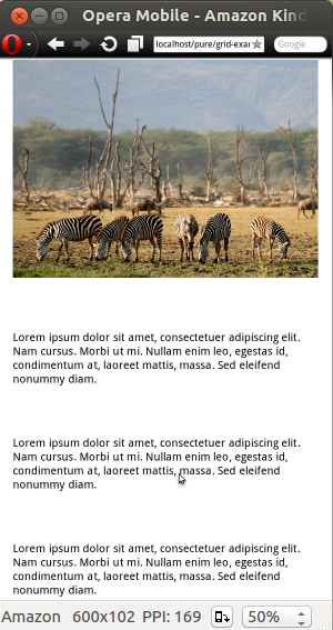
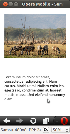
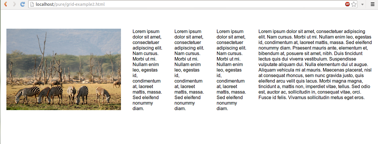
Following slideshow shows you how the said layout looks in three different screen sizes, Amazon Kindle Fire, Samsung Galaxy and Desktop (1366X768). We have used Opera Mobile Emulator for taking snaps of different screens. Notice that the image is responding to the size of the screen and not breaking.
CSS for Grid units
To begin with, this CSS sets certain styles for a host of predefined grid units.
display: inline-block; is set to keep the columns next to each other.
zoom: 1; is used to keep the content 100% zoomed with respect to the viewport of the rendering device.
letter-spacing: normal; and word-spacing: normal; sets no extra space between characters as well as words.
Vertical alignment is set to top with vertical-align: top;
With text-rendering: auto; Browser's default text rendering nature is kept unaltered.
Then, pure-u-1 class is set to display: block;
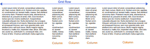
In addition to the above, for a number of grid units, width is set. For setting width, '%' is used as units to keep things responsive. The general format used for setting width is: .pure-u-x-y {width: (x/y*100)%;}, where x and y are positive integers.
So, if x is 4 and y is 5, for .pure-u-4-5, width is 80%. Again, if x is 1 and y is 6, width for .pure-u-1-6 is 16.656%. Notice, often decimal values are used for setting width to bring the layout to near perfection.
The above pictorial may help you to understand the concept better.
We are going to publish a series of tutorials on each of the modules. Please bookmark this page or subscribe to our RSS.
Previous: Pure - responsive CSS modules,framework from Yahoo yui for your web projects
- Weekly Trends and Language Statistics
- Weekly Trends and Language Statistics