Twitter Bootstrap Alerts and Errors tutorial
Introduction
Twitter Bootstrap allows you to style successful execution of a stuff, warning, and error messages of your website or app. In this tutorial, you will learn how to do that.
Creating a simple alert message
Using CSS class "alert", which is located from line number 2123 to 2175 of bootstrap.css version 2.0.1, you may create a simple alert message. You may add an optional close icon to it.
When you click the close icon in the alert box, it is closed. And for this interactivity, you have to add two JavaScript files jquery.js and alert.js. You may add them just before your body element closes.
Example of creating a simple alert message with Twitter Bootstrap
<!DOCTYPE html>
<html lang="en">
<head>
<meta charset="utf-8">
<title>Basic alerts with twitter bootstrap</title>
<meta name="description" content="Creating basic alerts with Twitter Bootstrap. Examples of alerts and errors with Twitter Bootstrap">
<link href="/twitter-bootstrap/twitter-bootstrap-v2/docs/assets/css/bootstrap.css" rel="stylesheet">
<style type="text/css">
body {
padding: 50px;
}
</style>
</head>
<body>
<div class="container">
<div class="row">
<div class="span4">
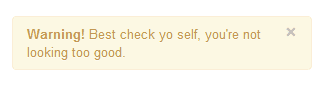
<div class="alert">
<a class="close" data-dismiss="alert">×</a>
<strong>Warning!</strong> Best check yo self, you're not looking too good.
</div>
</div>
</div>
</div>
<script src="twitter-bootstrap-v2/docs/assets/js/jquery.js"></script>
<script src="twitter-bootstrap-v2/docs/assets/js/bootstrap-alert.js"></script>
</body>
</html>
Note that from line number 18 to 21 are required. Everything else is for demonstration purpose only.
Output
View Online
View the above example in a different browser window.
Extending simple alert message
With two more CSS classes "alert-block " and "alert-heading", you may extend the previously shown simple alert message. It gives you more control over text to rendered and you may add a text header preceding the alert text.
When you click the close icon in the alert box, it is closed. And for this interactivity, you have to add two JavaScript files jquery.js and alert.js. You may add them just before your body element closes.
Example of extending simple alert message with Twitter Bootstrap
<!DOCTYPE html>
<html lang="en">
<head>
<meta charset="utf-8">
<title>Extending simple alert with twitter bootstrap</title>
<meta name="description" content="Extending simple alert with twitter bootstrap.">
<link href="/twitter-bootstrap/twitter-bootstrap-v2/docs/assets/css/bootstrap.css" rel="stylesheet">
<style type="text/css">
body {
padding: 50px;
}
</style>
</head>
<body>
<div class="container">
<div class="row">
<div class="span4">
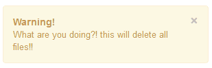
<div class="alert alert-block">
<a class="close" data-dismiss="alert">×</a>
<h4 class="alert-heading">Warning!</h4>
What are you doing?! this will delete all files!!
</div>
</div>
</div>
</div>
<script src="twitter-bootstrap-v2/docs/assets/js/jquery.js"></script>
<script src="twitter-bootstrap-v2/docs/assets/js/bootstrap-alert.js"></script>
</body>
</html>
Output
View Online
View the above example in a different browser window.
Creating alerts on error, success, and information
Twitter Bootstrap allows you to create alerts suitable to be rendered on error or danger, success, and information. For error, you need CSS class "alert-error", for success you need "alert-success" class and for the information you need a class "alert-info". And of course, like it is stated in the previous examples, you need to JS files jquery.js and alert.js.
Example of alerts on error, success, and information with Twitter Bootstrap
<!DOCTYPE html>
<html lang="en">
<head>
<meta charset="utf-8">
<title>Example alerts on error success and information with Twitter bootstrap</title>
<meta name="description" content="Example alerts on error success and information with Twitter bootstrap.">
<link href="/twitter-bootstrap/twitter-bootstrap-v2/docs/assets/css/bootstrap.css" rel="stylesheet">
<style type="text/css">
body {
padding: 50px;
}
</style>
</head>
<body>
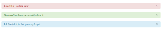
<div class="alert alert-error">
<a class="close" data-dismiss="alert">×</a>
<strong>Error!</strong>This is a fatal error.
</div>
<div class="alert alert-success">
<a class="close" data-dismiss="alert">×</a>
<strong>Success!</strong>You have successfully done it.
</div>
<div class="alert alert-info">
<a class="close" data-dismiss="alert">×</a>
<strong>Info!</strong>Watch this, but you may forget.
</div>
<script src="twitter-bootstrap-v2/docs/assets/js/jquery.js"></script>
<script src="twitter-bootstrap-v2/docs/assets/js/bootstrap-alert.js"></script>
</body>
</html>
Output
View Online
View the above example in a different browser window
You may download all the HTML, CSS, JS and image files used in our tutorials here.
Previous: Twitter Bootstrap pagination tutorial
Next:
Creating a Pricing Table with Twitter Bootstrap 3 list group component
- Weekly Trends and Language Statistics
- Weekly Trends and Language Statistics