Twitter Bootstrap Modals Tutorial
Description
Twitter Bootstrap Modal are created using a custom Jquery Plugin. It may be used to create modal windows to enrich user experience or to add functionality to users. You may use popover and tooltips within Modals.
In this tutorial, it is discussed how to create Modal windows using Twitter Bootstrap with several examples and explanations. Besides defaults, it also discusses various options available for customization.
What is required
You require Jquery, Twitter Bootstrap, CSS, and JavaScript file bootstrap-modal.js. The js file is available within js folder of your Twitter Bootstrap Download.
Jquery is available under docs > assets > js of your Twitter Bootstrap folder as jquery.js; or you may point to this https://ajax.googleapis.com/ajax/libs/jquery/1.7.1/jquery.min.js to load Jquery.
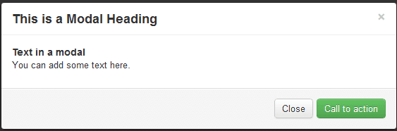
How does a Twitter Bootstrap Modal Look like
Bellow is an example of how Twitter Bootstrap Modal looks.
Using Twitter Bootstrap Modals in your website
Following is an example of how you may use Twitter Bootstrap Modals in your webpage. Notice that you don't need to write any JavaScript Code for doing so. An explanation is followed by and that says which is what in the example code.
<!DOCTYPE html>
<html lang="en">
<head>
<meta charset="utf-8">
<title>Twitter Bootstrap Modals Example</title>
<meta name="description" content="Creating Modal Window with Twitter Bootstrap">
<link href="/twitter-bootstrap/twitter-bootstrap-v2/docs/assets/css/bootstrap.css" rel="stylesheet">
</head>
<body>
<div class="container">
<h2>Example of creating Modals with Twitter Bootstrap</h2>
<div id="example" class="modal hide fade in" style="display: none; ">
<div class="modal-header">
<a class="close" data-dismiss="modal">×</a>
<h3>This is a Modal Heading</h3>
</div>
<div class="modal-body">
<h4>Text in a modal</h4>
<p>You can add some text here.</p>
</div>
<div class="modal-footer">
<a href="#" class="btn btn-success">Call to action</a>
<a href="#" class="btn" data-dismiss="modal">Close</a>
</div>
</div>
<p><a data-toggle="modal" href="#example" class="btn btn-primary btn-large">Launch demo modal</a></p>
</div>
<script src="https://ajax.googleapis.com/ajax/libs/jquery/1.7.1/jquery.min.js"></script>
<script src="/twitter-bootstrap/twitter-bootstrap-v2/js/bootstrap-modal.js"></script>
</body>
</html>
View Twitter Bootstrap Modals Example Live.
Explanation
The following table explains the code above. It will help you to understand how to use Twitter Bootstrap Modals.
| Line no in code | Code | Explanation |
|---|---|---|
| 12 | div id="example" | An ID is assigned to the associated division. The value of the id is referred in the JavaScript later to implement modal. |
| 12 | class="modal hide fade in" | Four CSS classes - modal, hide, fade and in of Twitter Bootstrap CSS are used to set the layout of the modal. |
| 12 | style="display: none; | This is used to keep the Modal Window invisible till a trigger comes (like a click on the associated button) |
| 13 | <div class="modal-header"> | modal-header is the class to define style for the header of the modal window. |
| 14 | a class="close" | CSS class close sets the style for the Close button of the modal window. |
| 14 | data-dismiss="modal" | data-dismiss is a custom HTML5 data attribute. Here it is used to close the modal window. |
| 17 | class="modal-body" | modal-body is a CSS class of Bootstrap CSS to set the style for body of the modal window. |
| 21 | class="modal-footer" | modal-footer is a CSS class of Bootstrap CSS to set the style for footer of the modal window. |
| 22 | class="btn btn-success" | CSS classes btn and btn-success are used to set the style for the larger button is modal window's footer. You may use any other Twitter Bootstrap buttons instead. |
| 23 | class="btn" | CSS button class btn of Bootstrap CSS is used to create a smaller button in the footer of the modal window. |
| 23 | data-dismiss="modal" | HTML5 custom data attribute data-dismiss is used to close the modal window. |
| 26 | data-toggle="modal" | HTML5 custom data attribute data-toggle is used to open the modal window. |
| 26 | class="btn btn-primary btn-large" | To set the style of the button which is to be clicked to create the modal window. |
| 27 | <script src="https://ajax.googleapis.com/ajax/libs /jquery/1.7.1/jquery.min.js"></script> | Jquery file is included. |
| 28 | <script src="/twitter-bootstrap/twitter-bootstrap-v2> /js/bootstrap-modal.js"></script> |
JS file for bootstrap modal is included. |
Using JavaScript
You may use JavaScript to implement Twitter Bootstrap Modal Window. For that just call the modal() in your JavaScript. Your code then looks like this and you may include this just before your body tag ends(i.e. </body>).
 $(function ()
{ $("#identifier").modal();
});
Where identifier is a Jquery selector to identify the associated container element. You will encounter what are the options in a while.
Options
There are certain options which may be used with modal() to customize the look and feel of the Modal Window.
backdrop
backdrop option is used to include a modal-backdrop element.
If you replace the code in line number 2 of the example under Using JavaScript with the following code, i.e. assigning a value of false to the backdrop option, then there will not be any modal-backdrop
{ $("#example").modal({backdrop:false});
keyboard
Because of the keyboard option, a modal window is closed when escape is pressed. Its type is boolean and the default value is true. If you set the value of the keyboard option as false, even if you press escape, the modal will not be closed.
If you replace the code in line number 2 of the example under Using JavaScript with the following code, i.e. assigning a value of false to the keyboard option, then pressing escape will not close the modal window.
{ $("#example").modal({keyboard:false});
show
Because of the show option, a modal window is showed when initialized. Its type is boolean and the default value is true. You set the value of the show option as false to initialize a modal without showing it. If you replace the code in line number 2 of the example under Using JavaScript.
{ $("#example").modal({show:false});
Methods
There are several methods which can be used with modal().
.modal(options)
This method activates your content as a modal. You may include an optional options object. Like, if you add the following code just before the </body> tag of the first example of this tutorial, there will not be any modal backdrop element.
$('#example').modal({
  backdrop: false
})
.modal('toggle')
This method toggles a modal manually. An example is as follows, which you may add just before the </body> tag of the first example of this tutorial, to manually toggle the modal.
$('#example').modal('toggle')
.modal(show)
This method may be used to manually open a modal. This code may be added just before the </body> tag of the first example of this tutorial.
$('#example').modal('show')
.modal(hide)
This method may be used to manually hide a modal. This code may be added just before the </body> tag of the first example of this tutorial.
$('#example').modal('hide')
Events
Following are the events to work with modal. These events may be used to hook
show
Immediately after show instance method is called, this method is called.
shown
When a modal has been made visible to users and CSS transition is complete, this event occurs.
hide
Immediately after the hide instance method has been called, this event is called.
hidden
When a modal has been made hidden from users and CSS transition is complete, this event occurs
You may download all the HTML, CSS, JS and image files used in our tutorials here.
Previous: Variations using Bootstrap Material Design
Next:
Twitter Bootstrap Popover Tutoriall