Responsive Web Design tutorial
Objective
Responsive Web Design has become an essential technique which every web designer must be conversant with. The purpose of this tutorial(a series of tutorials) is to provide our users with the necessary material to learn from and apply Responsive Web Design in their own projects.
What is Responsive Web Design
Responsive Web Design is a concept which leads to design a website or app in such a way that the same design can be rendered across various devices of different screen sizes and orientations providing the users with the best possible user experience, if not similar.
We will use a simple use case to understand the concept better. For that, we will use two simple web pages, one devised with Responsiveness and another one without it. You can view the responsive web page here and the unresponsive/fixed one here.
Now if we view the first one (the responsive one) with various devices and then the unresponsive fixed one with those devices again, you will notice that the responsive one have gone through some changes and is being rendered in such a way that the content along with the other UI components can be viewed without hassles. But the fixed/unresponsive web page fails to deliver such an experience. We have used Opera Mobile Emulator, which is an excellent tool to test your design across devices of different screen size.
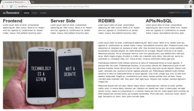
This is how the responsive web page looks in desktop
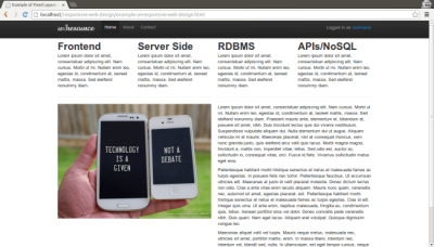
This is how the unresponsive web page looks in desktop
So, on a desktop they look almost same. Let's see how they look on a Amazon Kindle Fire, which has screen size different than desktop.
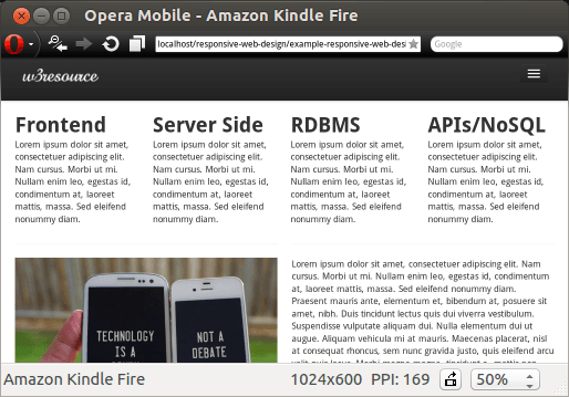
So, here is how the responsive design looks on Amazon Kindle Fire.
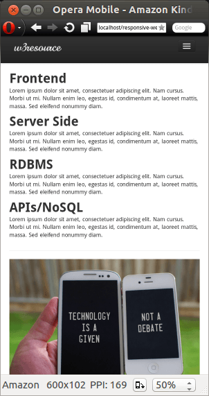
Here is how the responsive design looks on Amazon Kindle Fire. You will notice that the way content is rendered, leaves you with a very poor user experience.
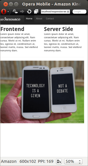
For responsive Design, even if we change the orientation, we get a good user experience.
Hopefully, now it is evident that Responsive Web Design is the answer to the challenge of rendering you website/app across various devices with different screen size and orientation. And it becomes so much of a necessity when you think about you users. It is quite impossible to know from which device they will view your site/app. Sure, you can develop a pattern of your users (from which devices they are viewing your site/app) over a period of time digging deep into some analytics data collected, but by then you will loose some potential customers for sure since they will not be satisfied with the user experience you offer with your broken(i.e. fixed) design. And that may be the last thing you want to happen with your project.
Well, you may think of designing different designs for Desktop and Mobile but the time and effort you have to put to do that is not worth if you can design a device agnostic one.
Proliferation of mobile devices
Now the next question which may come to our mind is, is there that much of users will be there to view my site/app on mobile? The way the use of mobile devices are proliferating and consumption mobile data is increasing, there will be a significant amount of users those who will view your project from mobile devices. Let's see some data to support this assertion.
You can see Responsive Web Design Trends (from Google Trends)
According to mobiThink, a leading website providing advice and insights on mobile Web marketing, global Mobile cellular subscriptions is 6,835 million. Active mobile broadband subscriptions are 2,096 million globally. And global mobile broadband growth is (CAGR 2010-2013) 40%.
Data source:http://mobithinking.com/mobile-marketing-tools/latest-mobile-stats/a#subscribers
According to Gartner, at least 60 percent of the information workers will content applications via a mobile device by the year 2015. That clearly means more and more applications will be delivered mobile-ready and as a developer/designer, your app too must be confirming to that state.
Data source:http://www.gartner.com/newsroom/id/2529315
According to Cisco, in 2012, global mobile data traffic grew 70 percent. It reached 885 petabytes per month at the end of 2012, which is 520 petabytes more per month than at the end of 2011.
Data source:http://www.cisco.com/en/US/solutions/collateral/ns341/ns525/ns537/ns705/ns827/white_paper_c11-520862.html
Forrester, a leading research, and analyst firm, says that in 2013, estimated $12 Billion will be spent on mobile retail in the US. They also expect that mobile commerce penetration rate will be doubled by 2017.
Data source:http://blogs.forrester.com/category/mobile_commerce
IDC says that sales of smartphones and tablets will grow by 20% in 2013 accounting for 20% of all IT sales, and 57% of all IT market growth. They said moreover that without smart mobile devices, IT industry growth will be mere 2.9%.
Data source: http://www.idc.com/research/Predictions13/downloadable/238044.pdf
Another set of data from IDC says that shipment of ‘Smart connected’ devices that is devices like smartphones, tablets, and other portable computing items which are capable of connecting to the internet will be topping 1.1 million units in this year and by 2016 it will be hitting 1.84 billion units, double of number units in 2011.
Data source: http://jamesburchill.com/nearly-a-billion-smart-devices-last-year-2-billion-by-2016/
Now all these data clearly indicates that mobile devices capable of connecting to the internet are proliferating rapidly and your project must be mobile ready to cope up.
Birth and evolution of responsive web design
The term responsive design was first coined by ETHAN MARCOTTE in his brilliant article published on A list apart in May 2010. Ethan felt the demand from his clients asking for mobile ready websites liked many other designers. The point is to create a website which is adaptive to the device on which it is being rendered. Many of the concepts adopted to web design are taken from other disciplines of design, print media may claim itself the source from where most of the inspirations came. For responsive design, a similar kind of concept from the field of architecture may be referred. It's a new concept in architecture where the actual environmental conditions are measured via sensors and buildings are enabled to adopt their form, shape, color or character responsively.
Designers started practicing the concept of designing an adaptive website/app which is based on a flexible layout and where images and other media elements are adaptive to the device they are being rendered on. But there are so many challenges and in this evolving concept, from typography to table and from media elements to displaying advertising- everything has to be considered. A plethora of tools has come out and in use. But in general, there are three components which are considered to be the cornerstone of the Responsive Web Design. We will see what they are and what are the other things which are considered while designing a responsive website.
Components
Flexible layout, Flexible images and media and Media queries are referred as the three main Ingredient of responsive web design.
A flexible layout is created using target and context of the rendering screen in mind, instead of a pixel based approach.
For rendering images and other media like video adaptively, several techniques are in use, using CSS to set the minimum width to 100% of rendering screen is the most common one.
A media query is a specification of w3c. It was available in the previous version of CSS (i.e. 2.1) itself. But in CSS3, it has been improved and this feature is now widely used to make the layout and other UI components adaptive to different devices.
Besides, typography, navigation, forms, tables, how advertising will be displayed all these are worth a study.
In the consequent tutorials we will discuss all these topics in detail with lots of code examples. Please subscribe to our RSS Feed for the upcoming tutorials.
A basic responsive web template
We will conclude this tutorial with a basic Responsive Web Design Template. Hopefully, that will turn you on to play around with the code available and dive deep into the world of Responsive Web Design.
Conclusion
Hopefully this sets the ground for learning a bit about Responsive web Design. Please Subscribe to our RSS Feed for upcoming tutorials in this series.