Introduction to Zurb Foundation 3
Zurb Foundation 3
Zurb Foundation 3 is a responsive front-end framework to build web sites and apps fast. It has all the basic as well as advanced features for rapid prototyping. In this document you will get an overview of what this framework may offer. This is going to be a series of tutorials covering all of the features of the framework, with lots of examples. So, we request you to join our RSS Feed and share it with your friends asking them to join us.
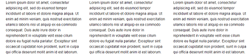
The Grid
Foundation 3 offers a 12 column typographic Grid which supports almost all sized device screen. This is awesome, since usage of different screen sizes are increasing rapidly, it is but obvious nowadays to build web sites or apps keeping various screen sizes in mind. Moreover, this Grid supports nesting, source ordering and offsets. So, however complex your Grid structure is, Foundation 3 will do the job for you.
The following image shows a three column grid created with Foundation 3. You may also view the example live.
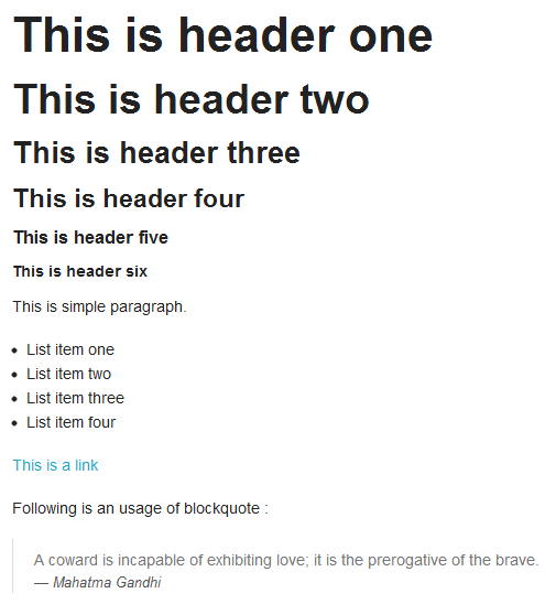
Typography
Typography of the framework is based on a golden ratio modular scale, which ensures that, your typography throughout the page looks great. It is also easy to change both size and ratio of the text in your web page.
The following image shows typical typographic usage created with Foundation 3. You may also view the example live.
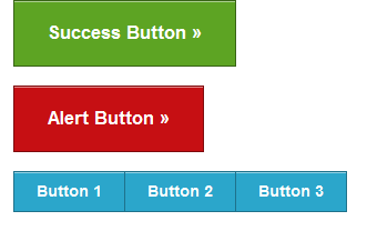
Buttons
Buttons are primary interactive element of your website or app. Foundation 3 offers styles and patterns to create simple Call To Action buttons to complex application toolbar.
The following image shows some buttons created with Foundation 3. You may also view the example live.
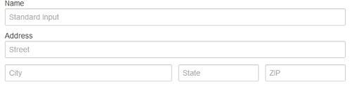
Forms
You may create elegant forms quickly and easily with this framework. From simple forms to complex ones. Validation states, Custom inputs, labels and actions are some of the features included.
The following image shows a simple form created with Foundation 3. You may also view the example live.
Navigation
You may create cross-device nav bar, vertical nav, side nav, sub nav and pagination with Foundation 3.
The following image shows a side nav created with Foundation 3. You may also view the example live.

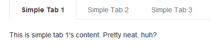
Tabs
You may create simple, contained, pill style, vertical and mobile tabs with Foundation 3.
The following image shows a tab based navigation created with Foundation 3. You may also view the example live.
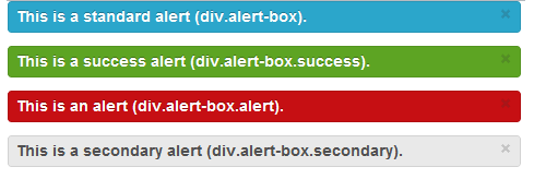
Elements
Grids, Navs, Tabs and Forms are not sufficient for you website. You need so many other components too. With Foundation 3, you may create Alerts, Labels, Tooltips, Keystrokes, Panels, Linklists etc.
The following screenshot shows alerts created with Foundation 3. You may also view the example live.
Orbit
This is a Jquery Plugin for creating responsive image or content slider.
You may view the demo online.
Reveal
This is another Jquery Plugin for creating modals.
You may view the demo online.
Download Foundation 3
You may download the default CSS of Foundation 3 from http://foundation.zurb.com/download.php. This is a minified CSS and does not require any tool (e.g. SaaS).
You may download the Custom CSS of Foundation 3 from the same url by selecting only the components we need to include.
You may also download the Sass + Compass version of Foundation 3 from the same page
Next: Create multi-device layouts with Zurb Foundation 3 Grid