Zurb Foundation 3 Navigation
Forms
In this tutorial, you will see how to create Navigations with Zurb Foundation 3. The framework offers navigations for various context and they are capable to be rendered across various devices.
Navbar
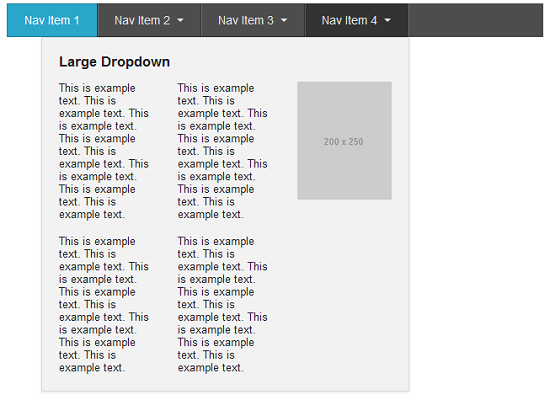
The framework provides you with a Top Navbar which may have main navigations. You may also create dropdowns with hover effects. These dropdowns may contain a host of other contents, like other navigations and even grids. Let's see the following example:
Code:
<!doctype html>
<html>
<head>
  <title>Navbar Example, created with Foundation 3</title>
  <link rel="stylesheet" href="/zurb-foundation3/foundation3/stylesheets/foundation.css">
</head>
<body>
<div class="row">
<div class="eight columns">
<ul class="nav-bar">
            <li class="active"><a href="#">Nav Item 1</a></li>
            <li class="has-flyout">
              <a href="#">Nav Item 2</a>
              <a href="#" class="flyout-toggle"><span> </span></a>
              <ul class="flyout" style="display: none; ">
                <li><a href="#">Sub Nav Item 1</a></li>
                <li><a href="#">Sub Nav Item 2</a></li>
                <li><a href="#">Sub Nav 3</a></li>
                <li><a href="#">Sub Nav 4</a></li>
                <li><a href="#">Sub Nav Item 5</a></li>
              </ul>
            </li>
            <li class="has-flyout">
              <a href="#">Nav Item 3</a>
              <a href="#" class="flyout-toggle"><span> </span></a>
              <div class="flyout" style="display: none; ">
                <h5>Regular Dropdown</h5>
                <div class="row">
                  <div class="four columns">
                    <p>This is example text. This is example text. This is example text. This is example text. This is example text. This is example text. This is example text. This is example text.</p>
                  </div>
                  <div class="four columns">
                    <p>This is example text. This is example text. This is example text. This is example text. This is example text. This is example text. This is example text. This is example text.</p>
                  </div>
                </div>
              </div>
            </li>
            <li class="has-flyout">
              <a href="#">Nav Item 4</a>
              <a href="#" class="flyout-toggle"><span> </span></a>
              <div class="flyout large right" style="display: none; ">
                <h5>Large Dropdown</h5>
                <div class="row">
                  <div class="four columns">
                    <p>This is example text. This is example text. This is example text. This is example text. This is example text. This is example text. This is example text. This is example text.</p>
                    <p>This is example text. This is example text. This is example text. This is example text. This is example text. This is example text. This is example text. This is example text.</p>
                  </div>
                  <div class="four columns">
                    <img src="http://placehold.it/200x250">
                  </div>
                </div>
              </div>
            </li>
          </ul>
</div>
</div>
<script src="//www.w3resource.com/zurb-foundation3/foundation3/javascripts/foundation.min.js"></script>
<script>
$(document).foundationNavigation();
</script>
</body>
</html>
Explanation
For creating the basic navbar, 'nav-bar' class is attached to the 'ul' element (line number 10). Then 'li' elements are used to create navigations within that. Class 'has-flyout' is attached to the 'li' elements of 'nav-item2',
'nav-item3' and 'nav-item4' (line numbers 12, 23 and 38), since all these render more comtent on hover. Class 'flyout' is attached to the 'div' elements, which contains the content rendered on hover. Notice line numbers 14, 25 and 40; all of them have '<a href="#" class="flyout-toggle"><span> </span></a>' which is used to render the flayout on hover.
Also, notice that direction of the flyouts is left by default. 'right' class is added to set the flayout direction right.
And of course, you need a bit of JavaSvcript. File 'foundation.min.js' is added and then '$(document).foundationNavigation();' is used to initialize the navigation and dropdowns.
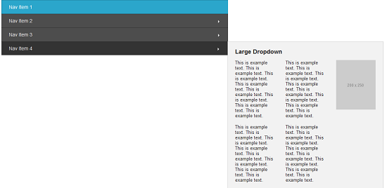
Vertical Navbar
By adding the 'vertical' class along with the 'nav-bar' class, you may make the navbar you created in the last example vertical. Here is how it looks:
Code:
<!doctype html>
<html>
<head>
  <title>Vertical navbar Example, created with Foundation 3</title>
  <link rel="stylesheet" href="/zurb-foundation3/foundation3/stylesheets/foundation.css">
</head>
<body>
<div class="row">
<div class="eight columns">
<ul class="nav-bar vertical">
            <li class="active"><a href="#">Nav Item 1</a></li>
            <li class="has-flyout">
              <a href="#">Nav Item 2</a>
              <a href="#" class="flyout-toggle"><span> </span></a>
              <ul class="flyout" style="display: none; ">
                <li><a href="#">Sub Nav Item 1</a></li>
                <li><a href="#">Sub Nav Item 2</a></li>
                <li><a href="#">Sub Nav 3</a></li>
                <li><a href="#">Sub Nav 4</a></li>
                <li><a href="#">Sub Nav Item 5</a></li>
              </ul>
            </li>
            <li class="has-flyout">
              <a href="#">Nav Item 3</a>
              <a href="#" class="flyout-toggle"><span> </span></a>
              <div class="flyout" style="display: none; ">
                <h5>Regular Dropdown</h5>
                <div class="row">
                  <div class="four columns">
                    <p>This is example text. This is example text. This is example text. This is example text. This is example text. This is example text. This is example text. This is example text.</p>
                  </div>
                  <div class="four columns">
                    <p>This is example text. This is example text. This is example text. This is example text. This is example text. This is example text. This is example text. This is example text.</p>
                  </div>
                </div>
              </div>
            </li>
            <li class="has-flyout">
              <a href="#">Nav Item 4</a>
              <a href="#" class="flyout-toggle"><span> </span></a>
              <div class="flyout large" style="display: none; ">
                <h5>Large Dropdown</h5>
                <div class="row">
                  <div class="four columns">
                    <p>This is example text. This is example text. This is example text. This is example text. This is example text. This is example text. This is example text. This is example text.</p>
                    <p>This is example text. This is example text. This is example text. This is example text. This is example text. This is example text. This is example text. This is example text.</p>
                  </div>
                  <div class="four columns">
                    <p>This is example text. This is example text. This is example text. This is example text. This is example text. This is example text. This is example text. This is example text.</p>
                    <p>This is example text. This is example text. This is example text. This is example text. This is example text. This is example text. This is example text. This is example text.</p>
                  </div>
                  <div class="four columns">
                    <img src="http://placehold.it/200x250">
                  </div>
                </div>
              </div>
            </li>
          </ul>
</div>
</div>
<script src="//localhost/zurb-foundation3/foundation3/javascripts/foundation.min.js"></script>
<script>
$(document).foundationNavigation();
</script>
</body>
</html>
Side Nav
Sometimes, instead of a nav bar (either top or vertical), it is suitable to use a side navigation. Here we go:

Code:
<!doctype html>
<html>
<head>
  <title>Side Nav Example, created with Foundation 3</title>
  <link rel="stylesheet" href="/zurb-foundation3/foundation3/stylesheets/foundation.css">
</head>
<body>
<div class="row">
<div class="six columns">
<ul class="side-nav">
  <li class="active"><a href="#">Link 1</a></li>
  <li><a href="#">Link 2</a></li>
  <li class="divider"></li>
  <li><a href="#">Link 3</a></li>
  <li><a href="#">Link 4</a></li>
</ul>
</div>
</div>
</body>
</html>
Sub Nav
Sub Navs are useful when you need to create different stages of a page. Here is an example:

Code:
<!doctype html>
<html>
<head>
  <title>Sub Nav Example, created with Foundation 3</title>
  <link rel="stylesheet" href="/zurb-foundation3/foundation3/stylesheets/foundation.css">
  <style type='text/css'>
   body {margin-top: 50px;}
  </style>
</head>
<body>
<div class="row">
<div class="six columns">
<dl class="sub-nav">
  <dt>Admin Panel:</dt>
  <dd class="active"><a href="#">All</a></dd>
  <dd><a href="#">Approved</a></dd>
  <dd><a href="#">Pending</a></dd>
  <dd><a href="#">Deleted</a></dd>
  <dd><a href="#">Spam</a></dd>
</dl>
</div>
</div>
</body>
</html>
Notice that unlike other navigation codes, instead of 'ul' and 'li', 'dl' and 'dd' is used to keep the structure semantic.
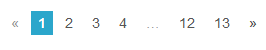
Pagination
When you need iteration through a long list of items, for example, you want to provide your user with a way to navigate over 100 blog posts, each page showing 10 of it, you need pagination. Here is how you may create one with Zurb Foundation 3.
Code:
<!doctype html>
<html>
<head>
  <title>Pagination Example, created with Foundation 3</title>
  <link rel="stylesheet" href="/zurb-foundation3/foundation3/stylesheets/foundation.css">
  <style type='text/css'>
   body {margin-top: 50px;}
  </style>
</head>
<body>
<div class="row">
<div class="six columns">
<ul class="pagination">
  <li class="arrow unavailable"><a href="">«</a></li>
  <li class="current"><a href="">1</a></li>
  <li><a href="">2</a></li>
  <li><a href="">3</a></li>
  <li><a href="">4</a></li>
  <li class="unavailable"><a href="">…</a></li>
  <li><a href="">12</a></li>
  <li><a href="">13</a></li>
  <li class="arrow"><a href="">»</a></li>
</ul>
</div>
</div>
</body>
</html>
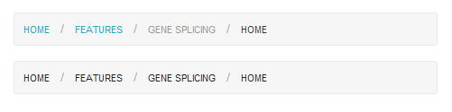
Breadcrumbs
Breadcrumbs are a great way to show your users where they are in your site hierarchy. It may also helpful to direct your users to the flow of content. With Foundation 3, you may create it like following:
Code:
<!doctype html>
<html>
<head>
  <title>Breadcrumbs Example, created with Foundation 3</title>
  <link rel="stylesheet" href="/zurb-foundation3/foundation3/stylesheets/foundation.css">

  <style type='text/css'>
   body {margin-top: 50px;}
  </style>
</head>
<body>
<div class="row">
<div class="six columns">
<ul class="breadcrumbs">
  <li><a href="#">Home</a></li>
  <li><a href="#">Features</a></li>
  <li class="unavailable"><a href="#">Gene Splicing</a></li>
  <li class="current"><a href="#">Home</a></li>
</ul>

<ul class="breadcrumbs">
  <li><span>Home</span></li>
  <li><span>Features</span></li>
  <li><span>Gene Splicing</span></li>
  <li class="current"><span>Home</span></li>
</ul>
</div>
</div>
</body>
</html>
In the example above, class 'unavailable' is used to state that the associated link is not available, and class 'current' is used to designate the active link.
Previous: Zurb Foundation 3 Forms
Next:
Create Responsive Image and Content Slider with Orbit