Zurb Foundation 3 Buttons
Buttons
In this tutorial, you will see how to create Buttons with Zurb Foundation 3. Foundation 3 Buttons are easy to use and customize. It has "button" CSS class which can be implemented on a hyperlink, input (where type="submit") and button element. And there are other CSS classes for creating variations like square, slightly rounded, completely rounded, large. medium, small etc.
Example
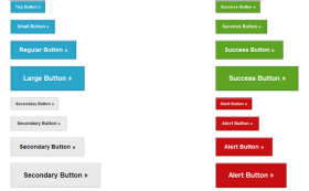
Here is an example containing typical buttons created with Foundation 3. Here is the screen shot:
Code:
<!DOCTYPE html>

<html lang="en"><head>

<meta charset="utf-8">

<title>Example of buttons with Zurb Foundation 3</title>

<link rel="stylesheet" href="/zurb-foundation3/foundation3/stylesheets/foundation.css">

<meta name="description" content="Example of buttons with Zurb Foundation 3." />

</head>

<body>

<div class="row">

<div class="six columns">

<p><a href="#" class="tiny button">Tiny Button »</a></p>

<p><a href="#" class="small button">Small Button »</a></p>

<p><a href="#" class="button">Regular Button »</a></p>

<p><a href="#" class="large button">Large Button »</a></p>

<p><a href="#" class="tiny secondary button">Secondary Button »</a></p>

<p><a href="#" class="small secondary button">Secondary Button »</a></p>

<p><a href="#" class="secondary button">Secondary Button »</a></p>

<p><a href="#" class="large secondary button">Secondary Button »</a></p>

</div>

<div class="six columns">

<p><a href="#" class="tiny success button">Success Button »</a></p>

<p><a href="#" class="small success button">Success Button »</a></p>

<p><a href="#" class="success button">Success Button »</a></p>

<p><a href="#" class="large success button">Success Button »</a></p>

<p><a href="#" class="tiny alert button">Alert Button »</a></p>

<p><a href="#" class="small alert button">Alert Button »</a></p>

<p><a href="#" class="alert button">Alert Button »</a></p>

<p><a href="#" class="large alert button">Alert Button »</a></p>

</div>

</div>

</body>

</html>
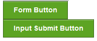
Here is another example where button and success class is applied to input and button element to create form buttons:
Code:
<!DOCTYPE html>

<html lang="en"><head>

<meta charset="utf-8">

<title>Example of form buttons with Zurb Foundation 3</title>

<link rel="stylesheet" href="/zurb-foundation3/foundation3/stylesheets/foundation.css">

<meta name="description" content="Example of buttons with Zurb Foundation 3." />

</head>

<body>

<div class="row">

<div class="six columns">

<button class="success button">Form Button</button><br>

<input type="submit" class="success button" value="Input Submit Button">

</div>

</div>

</body>

</html>
Button Groups
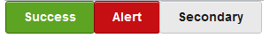
Sometimes you may need a group of Buttons. Foundation 3 has provision for that too. Here is an example:
Code:
<!DOCTYPE html>
<html lang="en"><head>
<meta charset="utf-8">
<title>Example of button groups with Zurb Foundation 3</title>
<link rel="stylesheet" href="/zurb-foundation3/foundation3/stylesheets/foundation.css">
<meta name="description" content="Example of button groups with Zurb Foundation 3." />
</head>
<body>
<div class="row">
<div class="six columns">
<ul class="button-group [radius, rounded]">
  <li><a href="#" class="success button radius">Button 1</a></li>
  <li><a href="#" class="alert button radius">Button 2</a></li>
  <li><a href="#" class="secondary button radius">Button 3</a></li>
</ul>
</div>
</div>
</body>
</html>
Even Button Groups
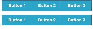
Sometimes you may need to fill the columns of a grid with button groups. For that, you have to add two Foundation 3 CSS classes on the associated 'ul' element of the lists holding buttons. One is ".even" and according to your requirement, you have to add either '.two-up' or '.three-up' or '.four-up' or '.five-up'. Here is the screen shot:

Code:
<!DOCTYPE html>
<html lang="en"><head>
<meta charset="utf-8">
<title>Example of even button groups with Zurb Foundation 3</title>
<link rel="stylesheet" href="/zurb-foundation3/foundation3/stylesheets/foundation.css">
<meta name="description" content="Example of even button groups with Zurb Foundation 3." />
</head>
<body>
<div class="row">
<div class="six columns">
<ul class="button-group even three-up">
<li><a href="#" class="success button">Button 1</a></li>
<li><a href="#" class="alert button">Button 2</a></li>
<li><a href="#" class="secondary button">Button 3</a></li>
</ul>
</div>
</div>
</body>
</html>
Button Bars
In a web page, if you want to render a group actions (through buttons) those are related, then you may use this. Here is the screen shot:
Code:
<!DOCTYPE html>
<html lang="en"><head>
<meta charset="utf-8">
<title>Example of button bar with Zurb Foundation 3</title>
<link rel="stylesheet" href="/zurb-foundation3/foundation3/stylesheets/foundation.css">
<meta name="description" content="Example of button bars with Zurb Foundation 3." />
</head>
<body>
<div class="row">
<div class="six columns">
<div class="button-bar">
  <ul class="button-group">
    <li><a href="#" class="button">Button 1</a></li>
    <li><a href="#" class="button">Button 2</a></li>
    <li><a href="#" class="button">Button 3</a></li>
  </ul>

  <ul class="button-group">
    <li><a href="#" class="button">Button 1</a></li>
    <li><a href="#" class="button">Button 2</a></li>
    <li><a href="#" class="button">Button 3</a></li>
  </ul>
</div>
</div>
</div>
</body>
</html>
Dropdown Buttons
Dropdown Buttons are excellent option under certain situations. Here is an example:
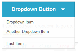
Code:
<div href="#" class="large button dropdown">
  Dropdown Button
  <ul>
    <li><a href="#">Dropdown Item</a></li>
    <li><a href="#">Another Dropdown Item</a></li>
    <li class="divider"></li>
    <li><a href="#">Last Item</a></li>
  </ul>
</div>
Split Buttons
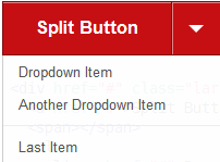
Code:
<div href="#" class="large alert button split dropdown">
  <a href="#">Split Button</a>
  <span></span>
  <ul>
    <li><a href="#">Dropdown Item</a></li>
    <li><a href="#">Another Dropdown Item</a></li>
    <li class="divider"></li>
    <li><a href="#">Last Item</a></li>
  </ul>
</div>
Previous: Zurb Foundation 3 Typography
Next:
Zurb Foundation 3 Forms