Zurb Foundation 3 Forms
Forms
In this tutorial, you will see how to create Forms with Zurb Foundation 3. The way Forms can be created with Foundation 3, is versatile. Let's begin with a simple example.
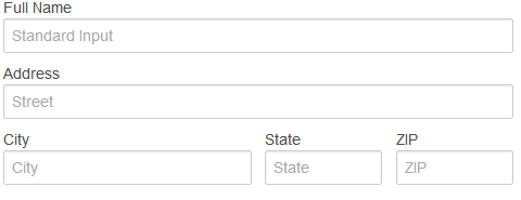
Form (row layout)
Code:
<!DOCTYPE html>
<html>
<head>
  <title>Form (row layout) with Foundation 3</title>
  <link rel="stylesheet" href="/zurb-foundation3/foundation3/stylesheets/foundation.css">
</head>
<body>
<div class="row">
<div class="six columns">
<form>
  <label>Full Name</label>
  <input type="text" placeholder="Standard Input" />

  <label>Address</label>
  <input type="text" class="twelve" placeholder="Street" />
  <div class="row">
    <div class="six columns">
	  <label>City</label>
      <input type="text" placeholder="City" />
    </div>
    <div class="three columns">
	  <label>State</label>
      <input type="text" placeholder="State" />
    </div>
    <div class="three columns">
	  <label>ZIP</label>
      <input type="text" placeholder="ZIP" />
    </div>
  </div>
</form>
</div>
</div>
</body>
</html>
Now, we can conclude the following from the above example:
- the size of the input can be determined using column size.
- rows can be created inside the form element. You can also define columns within that. If rows are created inside a from, they get some special padding by default for spacing.
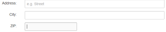
Labels next to input
Sometimes, you may want to keep your labels at the left of your form's input. Here is an example:
Code:
<!DOCTYPE html>
<html>
<head>
  <title>Form label left with Foundation 3</title>
  <link rel="stylesheet" href="/zurb-foundation3/foundation3/stylesheets/foundation.css">
</head>
<body>
<form>
<div class="row">
<div class="two mobile-one columns">
 <label class="right inline">Address:</label>
 </div>
 <div class="ten mobile-three columns">
 <input type="text" placeholder="e.g. Street" class="eight">
 </div>
 </div>
 <div class="row">
 <div class="two mobile-one columns">
 <label class="right inline">City:</label>
 </div>
 <div class="ten mobile-three columns">
 <input type="text" class="eight">
 </div>
 </div>
 <div class="row">
  <div class="two mobile-one columns">
  <label class="right inline">ZIP:</label>
  </div>
  <div class="ten mobile-three columns">
   <input type="text" class="three">
   </div>
  </div>
</form>
</body>
</html>
So, two classes to remember from the last example. One is '.right' and '.inline'.
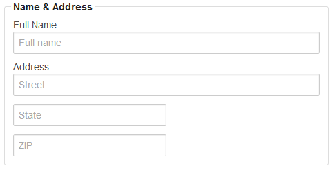
Fieldset
Fieldsets wrap a number of co-related inputs. This example shows how to use fieldsets:
Code:
<!DOCTYPE html>
<html>
<head>
  <title>Form fieldssets with Foundation 3</title>
  <link rel="stylesheet" href="/zurb-foundation3/foundation3/stylesheets/foundation.css">
</head>
<body>
<div class="row">
<div class="six columns">
<form class="custom">
 <fieldset>
  <legend>Name & Address</legend>

<label>Full Name</label>
<input type="text" placeholder="Full name">
<label>Address</label>
<input type="text" placeholder="Street">
<input type="text" class="six" placeholder="State">
<input type="text" class="six" placeholder="ZIP">

</fieldset>
</form>
</div>
</div>
</body>
</html>
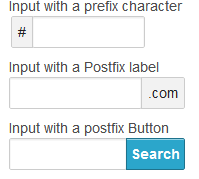
Input with prefix, postfix and actionable characters
Code:
<!DOCTYPE html>
<html>
<head>
  <title>Form prefix, postfix and action with Foundation 3</title>
  <link rel="stylesheet" href="/zurb-foundation3/foundation3/stylesheets/foundation.css">
</head>
<body>
<div class="row">
<div class="six columns">
<label>Input with a prefix character</label>
<div class="row">
  <div class="four columns">
    <div class="row collapse">
      <div class="two mobile-one columns">
        <span class="prefix">#</span>
      </div>
      <div class="ten mobile-three columns">
        <input type="text" />
      </div>
    </div>
  </div>
</div>
<label>Input with a Postfix label</label>
<div class="row">
            <div class="five columns">
              <div class="row collapse">
                <div class="nine mobile-three columns">
                  <input type="text">
                </div>
                <div class="three mobile-one columns">
                  <span class="postfix">.com</span>
                </div>
              </div>
            </div>
          </div>
<label>Input with a postfix Button</label>
<div class="row">
  <div class="five columns">
    <div class="row collapse">
      <div class="eight mobile-three columns">
        <input type="text" />
      </div>
      <div class="four mobile-one columns">
        <a href="#" class="postfix button">Search</a>
      </div>
    </div>
  </div>
</div>
</div>
</div>
</body>
</html>
Error States
By adding CSS class '.error' to elements like label, input and small or to a container column or a div, you may include error states using Foundation 3. Here is a snippet of code:
<div class="row">
  <div class="five columns">
    <label class="error">Field with Error</label>
    <input type="text" class="error" />
    <small class="error">Invalid entry</small>
  </div>
</div>
Radio button and checkboxes
You can create smart looking Radio buttons and checkboxes with Foundation 3. For doing so, you have to add '.custom' class to the form and you have to add jquery.min.js and jquery.customforms.js to the web page. Here is an example.
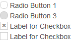
Code:
<!DOCTYPE html>
<html>
<head>
  <title>Form Radio buttons and check boxes with Foundation 3</title>
  <link rel="stylesheet" href="/zurb-foundation3/foundation3/stylesheets/foundation.css">
</head>
<body>
<form class="custom">
  <label for="radio1">
    <input name="radio1" type="radio" id="radio1"> Radio Button 1
  </label>

  <label for="radio2">
    <input name="radio1" type="radio" id="radio2" disabled> Radio Button 3
  </label>
  <label for="checkbox1">
  <input type="checkbox" id="checkbox1" style="display: none;">
  <span class="custom checkbox"></span> Label for Checkbox
</label>

<label for="checkbox2">
  <input type="checkbox" id="checkbox2" style="display: none;">
  <span class="custom checkbox"></span> Label for Checkbox
</label>

</form>
<script src="/zurb-foundation3/foundation3/javascripts/jquery.min.js"></script>
<script src="/zurb-foundation3/foundation3/javascripts/jquery.customforms.js"></script>
</body>
</html>
Dropdown / Select Elements
Here is an example of how to create Dropdown and Select elements with Foundation 3.
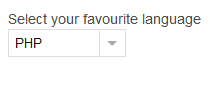
Code:
<!DOCTYPE html>
<html>
<head>
  <title>Form dropdown / select elements with Foundation 3</title>
  <link rel="stylesheet" href="/zurb-foundation3/foundation3/stylesheets/foundation.css">
</head>
<body>
<div class="row">
<h2>Form dropdown / select elemenets with Foundation 3</h2>
<form class="custom">
  <label for="customDropdown">Select your favourite language</label>
<select style="display:none;" id="customDropdown">
  <option SELECTED>PHP</option>
  <option>Ruby</option>
  <option>ASP.NET</option>
</select>
</div>
</form>
<script src="/zurb-foundation3/foundation3/javascripts/jquery.min.js"></script>
<script src="/zurb-foundation3/foundation3/javascripts/jquery.customforms.js"></script>
</body>
</html>
Previous: Zurb Foundation 3 Buttons
Next:
Zurb Foundation 3 Navigation