Matplotlib Bar Chart: Create bar plot of scores by group and gender
Matplotlib Bar Chart: Exercise-10 with Solution
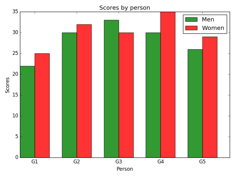
Write a Python program to create bar plot of scores by group and gender. Use multiple X values on the same chart for men and women.
Sample Data:
Means (men) = (22, 30, 35, 35, 26)
Means (women) = (25, 32, 30, 35, 29)
Sample Solution:
Python Code:
import numpy as np
import matplotlib.pyplot as plt

# data to plot
n_groups = 5
men_means = (22, 30, 33, 30, 26)
women_means = (25, 32, 30, 35, 29)

# create plot
fig, ax = plt.subplots()
index = np.arange(n_groups)
bar_width = 0.35
opacity = 0.8

rects1 = plt.bar(index, men_means, bar_width,
alpha=opacity,
color='g',
label='Men')

rects2 = plt.bar(index + bar_width, women_means, bar_width,
alpha=opacity,
color='r',
label='Women')

plt.xlabel('Person')
plt.ylabel('Scores')
plt.title('Scores by person')
plt.xticks(index + bar_width, ('G1', 'G2', 'G3', 'G4', 'G5'))
plt.legend()

plt.tight_layout()
plt.show()
Sample Output:
Go to:
PREV : Write a Python programming to display a bar chart of the popularity of programming Languages. Increase bottom margin.
NEXT :
Write a Python program to create bar plot from a DataFrame.
Python Code Editor:
Contribute your code and comments through Disqus.
What is the difficulty level of this exercise?