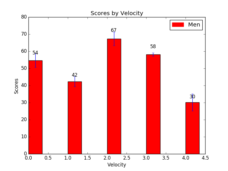
Matplotlib Bar Chart: Create bar plots with errorbars on the same figure and attach a text label above each bar
Matplotlib Bar Chart: Exercise-13 with Solution
Write a Python program to create bar plots with errorbars on the same figure. Attach a text label above each bar displaying men means (integer value).
Sample Date
Mean velocity: 0.2474, 0.1235, 0.1737, 0.1824
Standard deviation of velocity: 0.3314, 0.2278, 0.2836, 0.2645
Sample Solution:
Python Code:
import numpy as np
import matplotlib.pyplot as plt
import matplotlib.patches as mpatches

N = 5
men_means = (54.74, 42.35, 67.37, 58.24, 30.25)
men_std= (4, 3, 4, 1, 5)

ind = np.arange(N)  # the x locations for the groups
width = 0.35       # the width of the bars

fig, ax = plt.subplots()
rects1 = ax.bar(ind, men_means, width, color='r', yerr=men_std)

# add some text for labels, title and axes ticks
plt.ylabel('Scores')
plt.xlabel('Velocity')
plt.title('Scores by Velocity')

red_patch = mpatches.Patch(color='red', label='Men')
plt.legend(handles=[red_patch])


def autolabel(rects):
    """
    Attach a text label above each bar displaying its height
    """
    for rect in rects:
       height = rect.get_height()
       ax.text(rect.get_x() + rect.get_width()/2., 1.05*height,
                '%d' % int(height),
       ha='center', va='bottom')
autolabel(rects1)
plt.show()
Sample Output:

Go to:
PREV : Write a Python program to create bar plots with errorbars on the same figure.
NEXT :
Write a Python program to create a stacked bar plot with error bars.
Python Code Editor:
Contribute your code and comments through Disqus.
What is the difficulty level of this exercise?
