Matplotlib Basic: Create multiple types of charts on a single set of axes
Matplotlib Basic: Exercise-12 with Solution
Write a Python program to create multiple types of charts (a simple curve and plot some quantities) on a single set of axes.
Sample Solution:
Python Code:
import datetime as DT
from matplotlib import pyplot as plt
from matplotlib.dates import date2num
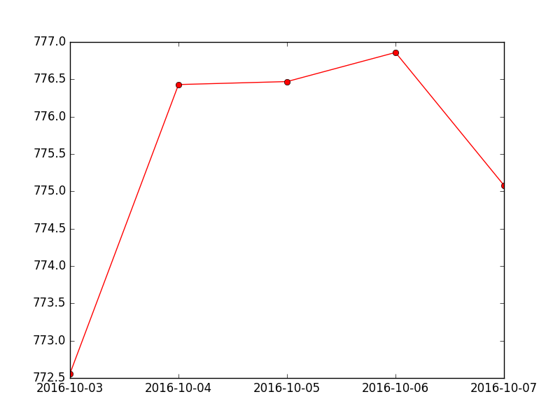
data = [(DT.datetime.strptime('2016-10-03', "%Y-%m-%d"), 772.559998),
(DT.datetime.strptime('2016-10-04', "%Y-%m-%d"), 776.429993),
(DT.datetime.strptime('2016-10-05', "%Y-%m-%d"), 776.469971),
(DT.datetime.strptime('2016-10-06', "%Y-%m-%d"), 776.859985),
(DT.datetime.strptime('2016-10-07', "%Y-%m-%d"), 775.080017 )]
x = [date2num(date) for (date, value) in data]
y = [value for (date, value) in data]
fig = plt.figure()
graph = fig.add_subplot(111)
# Plot the data as a red line with round markers
graph.plot(x,y,'r-o')
# Set the xtick locations
graph.set_xticks(x)
# Set the xtick labels
graph.set_xticklabels(
[date.strftime("%Y-%m-%d") for (date, value) in data]
)
plt.show()
Sample Output:
Go to:
PREV : Write a Python program to plot several lines with different format styles in one command using arrays.
NEXT : Write a Python program to display grid and draw line charts of the closing value of Alphabet Inc. between October 3, 2016 to October 7, 2016. Customized the grid lines with linestyle -, width .5. and color blue.
Python Code Editor:
Contribute your code and comments through Disqus.
What is the difficulty level of this exercise?