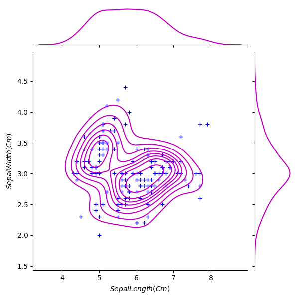
Python Scikit-learn: Create a joinplot using “kde” to describe individual distributions on the same plot between Sepal length and Sepal width and use ‘+’ sign as marker
Python Machine learning Iris Visualization: Exercise-12 with Solution
Write a Python program to create a joinplot using “kde” to describe individual distributions on the same plot between Sepal length and Sepal width and use ‘+’ sign as marker.
Note:
The kernel density estimation (kde) procedure visualize a bivariate distribution. In seaborn, this kind of plot is shown with a contour plot and is available as a style in jointplot().
Sample Solution:
Python Code:
import pandas as pd
import seaborn as sns
import matplotlib.pyplot as plt
iris = pd.read_csv("iris.csv")
g = sns.jointplot(x="SepalLengthCm", y="SepalWidthCm", data=iris, kind="kde", color="m")
g.plot_joint(plt.scatter, c="b", s=40, linewidth=1, marker="+")
g.ax_joint.collections[0].set_alpha(0)
g.set_axis_labels("$SepalLength(Cm)$", "$SepalWidth(Cm)$")
plt.show()
Sample Output:
Go to:
NEXT : Write a Python program to create a pairplot of the iris data set and check which flower species seems to be the most separable.
Python Code Editor:
Have another way to solve this solution? Contribute your code (and comments) through Disqus.
What is the difficulty level of this exercise?