Matplotlib Basic: Display the grid and draw line charts and customized the grid lines with rendering with a larger grid (major grid) and a smaller grid (minor grid).Turn on the grid but turn off ticks
Matplotlib Basic: Exercise-14 with Solution
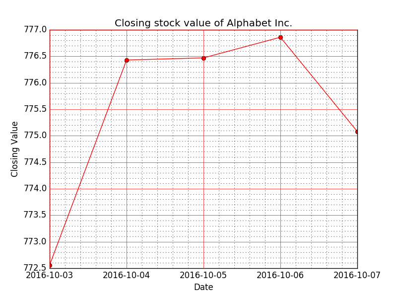
Write a Python program to display the grid and draw line charts of the closing value of Alphabet Inc. between October 3, 2016 to October 7, 2016. Customized the grid lines with rendering with a larger grid (major grid) and a smaller grid (minor grid).Turn on the grid but turn off ticks..
Date,Close
03-10-16,772.559998
04-10-16,776.429993
05-10-16,776.469971
06-10-16,776.859985
07-10-16,775.080017
Sample Solution:
Python Code:
import datetime as DT
from matplotlib import pyplot as plt
from matplotlib.dates import date2num

data = [(DT.datetime.strptime('2016-10-03', "%Y-%m-%d"), 772.559998),
        (DT.datetime.strptime('2016-10-04', "%Y-%m-%d"), 776.429993),
        (DT.datetime.strptime('2016-10-05', "%Y-%m-%d"), 776.469971),
        (DT.datetime.strptime('2016-10-06', "%Y-%m-%d"), 776.859985),
        (DT.datetime.strptime('2016-10-07', "%Y-%m-%d"), 775.080017 )]

x = [date2num(date) for (date, value) in data]
y = [value for (date, value) in data]

fig = plt.figure()

graph = fig.add_subplot(111)

# Plot the data as a red line with round markers
graph.plot(x,y,'r-o')

# Set the xtick locations
graph.set_xticks(x)

# Set the xtick labels
graph.set_xticklabels(
        [date.strftime("%Y-%m-%d") for (date, value) in data]
        )

# naming the x axis
plt.xlabel('Date')
# naming the y axis
plt.ylabel('Closing Value')
# giving a title
plt.title('Closing stock value of Alphabet Inc.')
# Turn on the minor TICKS, which are required for the minor GRID
plt.minorticks_on()

# Customize the major grid
plt.grid(which='major', linestyle='-', linewidth='0.5', color='red')
# Customize the minor grid
plt.grid(which='minor', linestyle=':', linewidth='0.5', color='black')

# Turn off the display of all ticks.
plt.tick_params(which='both', # Options for both major and minor ticks
                top='off', # turn off top ticks
                left='off', # turn off left ticks
                right='off',  # turn off right ticks
                bottom='off') # turn off bottom ticks
plt.show()
Sample Output:
Go to:
PREV : Write a Python program to display grid and draw line charts of the closing value of Alphabet Inc. between October 3, 2016 to October 7, 2016. Customized the grid lines with linestyle -, width .5. and color blue.
NEXT : Write a Python program to create multiple plots
Python Code Editor:
Contribute your code and comments through Disqus.
What is the difficulty level of this exercise?