Customizing JavaFX toggle buttons with CSS styling
4. ToggleButtons with Custom CSS Styles
Write a JavaFX program that creates toggle buttons in JavaFX and applies custom CSS styles to change their appearance when toggled on and off. Experiment with different colors and effects.
Sample Solution:
JavaFx Code:
// Main.java
import javafx.application.Application;
import javafx.scene.Scene;
import javafx.scene.control.Label;
import javafx.scene.layout.VBox;
import javafx.stage.Stage;

public class Main extends Application {

    @Override
    public void start(Stage primaryStage) {
        primaryStage.setTitle("Styled Labels");

        // Creating labels
        Label label1 = new Label("Label 1");
        Label label2 = new Label("Label 2");
        Label label3 = new Label("Label 3");

        // Setting IDs for labels to apply CSS styling
        label1.setId("custom-label");
        label2.setId("custom-label");
        label3.setId("custom-label");

        // Creating a VBox layout to hold the labels
        VBox vbox = new VBox(12, label1, label2, label3);
        vbox.getStyleClass().add("label-container");

        // Create a scene with the VBox layout
        Scene scene = new Scene(vbox, 300, 200);

        // Load CSS file to style the labels
        scene.getStylesheets().add(getClass().getResource("styles.css").toExternalForm());

        // Set the scene on the stage and display it
        primaryStage.setScene(scene);
        primaryStage.show();
    }

    public static void main(String[] args) {
        launch(args);
    }
}
/*styles.css*/

.custom-toggle-button {
    -fx-background-color: #DDDDDD; /* Default button color */
    -fx-font-size: 14px;
    -fx-padding: 8px 12px;
}

.custom-toggle-button:selected {
    -fx-background-color: #1E90FF; /* Selected button color */
    -fx-text-fill: white; /* Text color when selected */
    -fx-border-color: #1E90FF; /* Border color when selected */
    -fx-border-radius: 5px; /* Rounded corners */
}
Explanation:
In the exercise above the JavaFX code creates a window with two toggle buttons styled using CSS.
A brief explanation of the code follows:
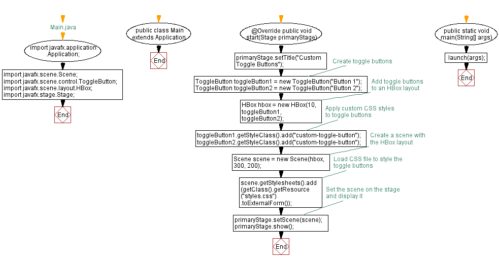
- Setting up the UI: The start method initializes a JavaFX window (Stage) with the title "Custom Toggle Buttons". Two toggle buttons (ToggleButton) labeled as "Button 1" and "Button 2" are created.
- Layout Structure: The toggle buttons are added to a horizontal box (HBox) layout with a spacing of 10 pixels between them using the HBox constructor.
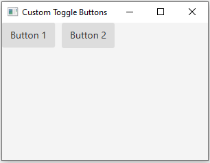
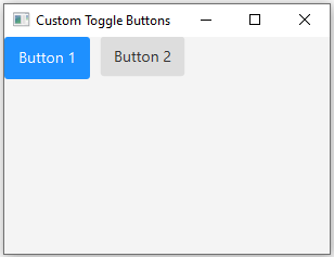
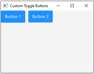
- Applying CSS Styling: Custom CSS styles are applied to the toggle buttons to modify their appearance. The buttons are given a class selector .custom-toggle-button, which defines the default styling for the buttons, such as background color, font size, and padding.
- Styling when Selected: The CSS rule .custom-toggle-button:selected defines the styling changes that occur when buttons are selected. It changes the background color, text color, border color, and adds rounded corners when a button is selected.
- Scene and Stylesheet: The scene (Scene) is created with the HBox layout and set to a size of 300x200 pixels. An external CSS file (styles.css) is loaded into the scene using scene.getStylesheets().add() to apply the specified styles to the toggle buttons.
- Launching the Application: The main method launches the JavaFX application by calling launch(args).
Sample Output:
Flowchart:

Go to:
PREV : Style Labels with Custom Fonts and Alignment.
NEXT : JavaFX Styling with External CSS File.
Java Code Editor:
What is the difficulty level of this exercise?
Test your Programming skills with w3resource's quiz.


