Matplotlib Bar Chart: Display a bar chart of the popularity of programming Languages
Matplotlib Bar Chart: Exercise-3 with Solution
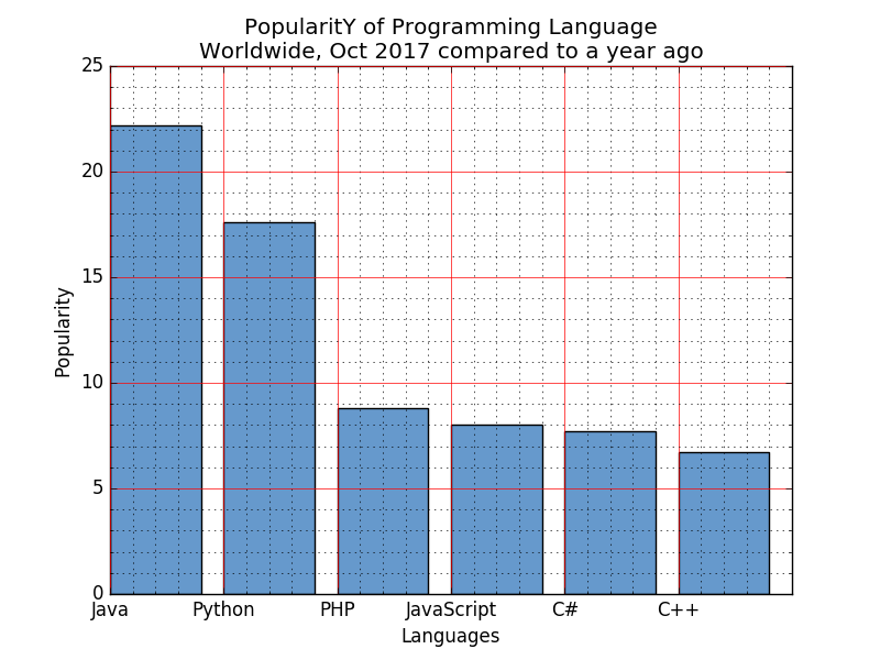
Write a Python programming to display a bar chart of the popularity of programming Languages. Use uniform color.
Sample data:
Programming languages: Java, Python, PHP, JavaScript, C#, C++
Popularity: 22.2, 17.6, 8.8, 8, 7.7, 6.7
Sample Solution:
Python Code:
import matplotlib.pyplot as plt
x = ['Java', 'Python', 'PHP', 'JavaScript', 'C#', 'C++']
popularity = [22.2, 17.6, 8.8, 8, 7.7, 6.7]
x_pos = [i for i, _ in enumerate(x)]

plt.bar(x_pos, popularity, color=(0.4, 0.6, 0.8, 1.0))

plt.xlabel("Languages")
plt.ylabel("Popularity")
plt.title("PopularitY of Programming Language\n" + "Worldwide, Oct 2017 compared to a year ago")
plt.xticks(x_pos, x)
# Turn on the grid
plt.minorticks_on()
plt.grid(which='major', linestyle='-', linewidth='0.5', color='red')
# Customize the minor grid
plt.grid(which='minor', linestyle=':', linewidth='0.5', color='black')
plt.show()
Sample Output:
Go to:
PREV : Write a Python programming to display a horizontal bar chart of the popularity of programming Languages.
NEXT :
Write a Python programming to display a bar chart of the popularity of programming Languages. Use different color for each bar.
Python Code Editor:
Contribute your code and comments through Disqus.
What is the difficulty level of this exercise?